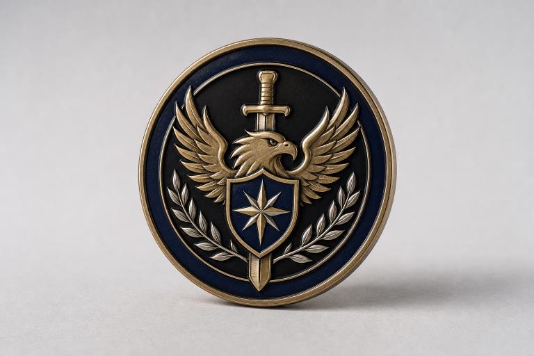
A meaningful challenge coin begins with a clear idea, not a crowded collection of images. Whether the coin recognizes service, marks an anniversary, honors a team, or commemorates an event, planning the message before the artwork helps every design choice feel intentional. Early concept sketches, notes, and tools such as an AI challenge coin generator can help a group explore directions before deciding what belongs on the finished coin.
The strongest designs are personal without trying to say everything at once. A well-planned coin gives recipients an immediate sense of what it represents, then reveals smaller details as they look more closely. That balance makes the coin easier to recognize, carry, display, and remember.
Start With Purpose
First, define why the coin exists. Common purposes include recognizing an achievement, celebrating a service milestone, strengthening team identity, remembering a person, or marking a reunion, mission, event, or anniversary. The purpose determines the tone. An award coin may need a formal emblem and a concise statement of achievement, while a reunion coin may place greater weight on a shared location, unit reference, or memorable date.
Challenge coins symbolize recognition, membership, and organizational pride, especially in military contexts. The history of challenge coins varies, highlighting that individual groups often value their own stories more than a single, definitive origin.
Know Who Will Receive the Coin
Identify the recipients before choosing art or wording. Consider their role, shared experience, location, age range, and the organization’s culture. A coin for a small operations team can reasonably include an internal motto or a specific reference that members understand. A coin for a large public event should usually rely on broader symbols that make sense to everyone who receives it.
Personal does not have to mean private. A landscape, mascot, building silhouette, service symbol, or date can create a strong connection without placing sensitive names, personal details, or confidential information on the design.
Build the Story Before the Artwork
Write a brief design statement before selecting colors, borders, or illustrations. Keep it to a few sentences and answer these questions:
- What group, event, or achievement does the coin represent?
- What should the recipient feel when holding it?
- Which place, date, or mission is most important?
- What is the one idea a viewer should notice first?
- Which details are interesting but not necessary?
This exercise gives the design a filter. If an element does not reinforce the central story, it can be removed or moved to supporting material such as packaging, an event program, or a display card.
Choose Symbols That Carry Meaning
One strong symbol usually has more impact than several unrelated ones. Choose images connected to the group’s work, values, local setting, heritage, or shared accomplishment. For example, a mountain outline may suit a team that trained or served in a particular region, while a compass can support a message about direction, exploration, or leadership.
Separate meaningful imagery from decoration that only fills empty space. Before approving an icon, ask whether it could be misunderstood outside the group. Official seals, badges, flags, logos, and protected insignia may also require permission or adherence to usage rules, so confirm approval before production.
Plan Both Sides With Care
Think of the front and back as one complete message. The front is often the right place for the main emblem, subject, or short phrase. The reverse can hold supporting information, such as a date, location, a secondary image, a motto, or an accomplishment. Sketch both sides together so the same information is not repeated unnecessarily.
Keep the visual language consistent across both sides. Similar type styles, border treatments, line weights, and color choices make the coin feel unified. A border can also protect text and small details from sitting too close to the outer edge.
Keep Text Short and Readable
Use only the wording needed to identify the coin and its message. Small lettering can become difficult to read at coin size, especially around a curved edge. Put the most important words in the clearest area and reserve smaller text for secondary details.
Test Wording at Actual Size
A short motto, such as “Service Above Self,” is easier to scan than a full sentence explaining the event. View the design at its intended dimensions and print a paper copy. If a name, date, or phrase is hard to read on paper, it is a warning that the layout needs simplification.
Select a Shape, Finish, and Color Direction
A classic round coin works for nearly any purpose, while a custom shape can reinforce a clear theme, such as a shield, state outline, vehicle, patch, or building. Choose a shape because it supports the story, not simply because it is unusual.
Raised and recessed areas, polished metal, textured surfaces, and color fill all affect how details stand out. Use a limited palette with a clear focal color, and ensure the design still communicates when viewed in black and white. Similar shades can blend together, while strong contrast helps separate important elements.
Avoid Common Design Mistakes
- Including too many symbols that compete for attention.
- Placing lettering or fine details too close to the edge.
- Using tiny images that disappear at actual size.
- Choosing colors with weak contrast.
- Using unclear abbreviations or incomplete dates.
- Mixing unrelated visual styles between the two sides.
- Using artwork without confirming permission or approval.
- Approving a design only because it looks impressive on a large screen.
Review the Design Before Production
A final review should test the message as well as the spelling. Ask someone outside the planning group what they notice first and what they think the coin represents. Then check every name, title, date, abbreviation, symbol, and line of text. Confirm that the front and back work together, view the art at the intended size, and request clear proof before giving final approval.
In a broader context, the ways organizations have used challenge coins show how they can serve as commemorative items, membership tokens, and recognition pieces. Your design does not need to imitate another group’s coin, but it should make its own purpose clear.
Use a Simple Final Checklist
- The purpose and recipients are clearly defined.
- The main symbol supports the story.
- The wording is brief and readable.
- The front and back work as a pair.
- The colors and finishes create enough contrast.
- Unnecessary details have been removed.
- Names, dates, and symbols have been checked.
- The final proof matches the approved concept.
Conclusion
A strong challenge coin does not need to capture every detail about a group or event. It needs one clear idea, supported by thoughtful symbols, readable wording, and a balanced layout. When planning comes before decoration, the finished coin can become a lasting reminder of shared service, work, identity, or achievement.