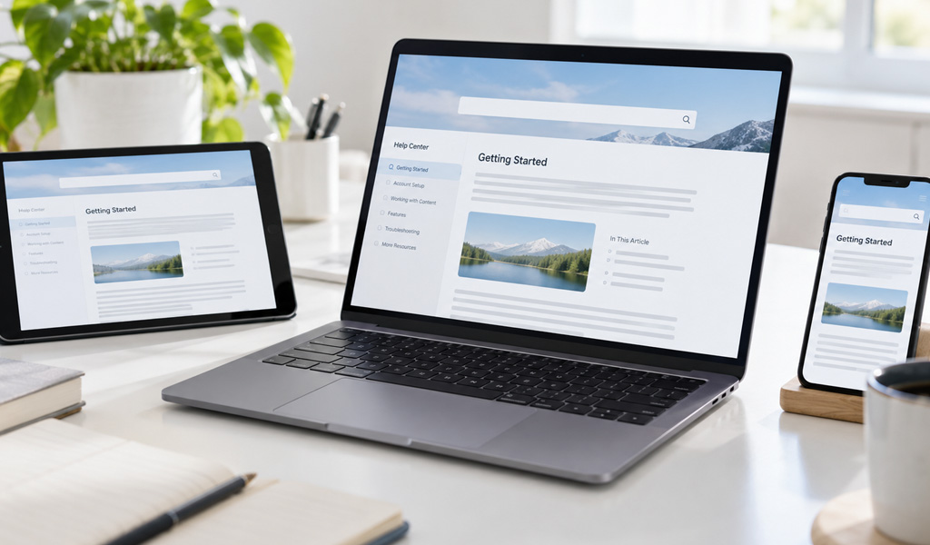
Users open help on whatever device is in their hand. For many, that is a phone. Mobile phones account for more than half of global web traffic, at 51.48 percent in the second quarter of 2026 (StatCounter, via Statista). That makes mobile a significant part of the web audience a documentation site may serve. Web help laid out for a wide monitor becomes pinch-and-zoom on a phone, and readers give up before they find an answer. An online help authoring tool publishes responsive web help, so the same pages fit a monitor, a tablet, and a phone without a second site to maintain.
Why Web Help Has to Fit Every Screen
One Output for Desktop, Tablet, and Phone
A responsive layout adjusts to the width of the screen. On a desktop, the navigation stays beside the content. On a phone, it collapses into a menu, and the text reflows to a single column. The layout does this with CSS media queries, the standard mechanism defined by the W3C for applying different styles at different screen widths (W3C, CSS Media Queries). Because the rules live in the same stylesheet, you maintain one output rather than a desktop site and a separate mobile one. A phone user gets tapped menus and readable text, while a desktop user gets the sidebar and the full width, from the same files.
What a Wide-Screen Layout Breaks on Mobile
A fixed desktop layout fails in specific ways on a small screen. Tables spill off the edge. Images shrink until the labels cannot be read. The reader zooms and scrolls sideways to follow a single line of text. Responsive output prevents each of these because it is built around the screen it lands on instead of one fixed width.
How the Tool Produces It
Templates Built to Adapt
An online help authoring tool such as Dr.Explain ships responsive templates, with the adaptive behavior built in rather than something you code from scratch. The table shows what changes as the screen narrows.
| On a wide screen | On a phone |
| Navigation sidebar beside the content | Navigation collapses into a menu |
| Multi-column layout | Content reflows to one column |
| Full images with visible callouts | Images scale to fit, callouts stay legible |
Where Responsive Layout Stops
Responsive layout applies to the web output, not to every format. A CHM opens through Microsoft’s HTML Help system and is intended for desktop Windows use, so responsive web layouts do not provide the mobile experience for it. For a desktop program that ships a CHM, that is no problem, because the help opens on a desktop beside the application. The point to keep in mind is division of labor: responsive design serves the web help and its phone readers, while the CHM stays a desktop, offline format. Teams that ship both plan around it, with the web help carrying the mobile experience and the CHM covering the in-app, offline case.
Hosting and Checking the Output
Where Web Help Lives
Published web help is a folder of HTML files. You put it on a web server, a subdomain, or an internal network for staff only. Because it is standard HTML, it needs no plugin and no app on the reader’s side, and Dr.Explain generates it from the same project that produces the CHM, PDF, and Word outputs. One source feeds the responsive site and the other formats alike.
Previewing Before You Publish
Responsive behavior is easy to confirm before it reaches users. Open the pages in a browser and drag the window narrow, or load them on a phone, and watch how tables, images, and the menu behave at the smallest width you support. Checking at that width is where layout problems show up, so it is worth doing before the help goes live rather than after a reader reports it.
What Responsive Help Gives the Reader
Answers Without Friction
A reader who finds the answer on the screen in front of them does not file a support ticket. Responsive web help removes the friction of a manual built for one device and opened on another. With mobile phones accounting for more than half of global web traffic, an online help authoring tool can serve desktop and mobile users from one publish.