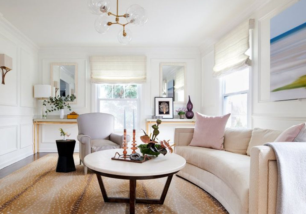
Wall lights can look out of place if the finish, size, or shape is completely out of harmony with the rest of the room. That little mismatch can make a polished space feel uneven even if the furniture and wall color look good together. The right choice helps to connect hardware, mirrors, artwork, and furniture without making the room feel too matchy. This guide will show you how to compare finishes, choose shapes, check scale, and position modern wall lights so they look like they belong in the design.
Start With Main Metal in the Room
Start with the metal details that catch the eye. In this step, contemporary wall lights are associated with taps, handles, mirror frames, or furniture legs. The finish doesn’t have to replicate every feature in the room. Just a shared tone is enough to make the space feel tranquil.
Warm brass against oak, cream paint, tan leather, and smooth stone. Polished nickel is a good choice for marble, glass, gray walls, and cold tiles, note Ravago Group Properties specialists. Black makes a reliable connection in a setting of diverse metals. This first check is a way of countering the style choices before they go too broad.
Warm Finishes Bring Softness
A space has a more comfortable atmosphere with brass and bronze. They work well in an environment with wood, linen, woven baskets, beige rugs, or clay tones. Soft glow for visual comfort. A warm finish that has impact can serve to boost the mood of the room in a bedroom or lounge.
If your decor already has patterns or intricacy, keep the design of the fixture plain. A narrow brass wall light next to a cream wall might look clean and tranquil. Bronze may provide depth next to dark timber or textured fabric. The finish should support the space.
Cool Metals for Clean & Fresh Decor
Chrome, nickel, and silver tones work well in interiors with sharp surfaces. They pair with mirrors, pale stone, glass, white tile, and cool grey paint. The group adds to a clean style with very little color. Good around vanities, hall mirrors, and tight entry walls.
Too many shiny surfaces and a cool metal can feel sharp. Matte paint, soft towels, wood shelving, or fabric seating can take the sheen off. A low-profile sconce can be used for both style and task lighting. When the finish echoes a surrounding detail, it feels tidy.
Let Dark Finishes Define the Wall
A wall is clearly defined in black, iron, and deep bronze. They look good against white, cream, pale grey, or stone. Art frames, door handles, curtain rods, or table bases can be reflected in a dark finish. This link brings order and needs no other ornamentation.
Dark finishes also work well in areas with lots of soft colours. They provide the eye a solid point with not much visual noise. A modern dark metal wall light can define a hall, book nook, or lunch area in open-plan environments. The impact is modest with clean-lined shapes.
Match End to Room Utilization
Each space demands a finish that suits everyday behaviors. Chrome, nickel, white, or matte black may work in a bathroom with tile and mirrors. Brass, bronze, or black alongside paintings and wood can soften the look of a dining area. The finished repeating door hardware can make a hallway seem more planned.
- Black goes well with light walls, dark frames, and rooms that need bolder outlines.
- Brass goes well with oak, cream stone, tan leather, and warm rugs.
- Chrome or nickel matches with mirrors, glass, tile, and cool paint.
The idea is to provide a finish that feels useful in the room. A bright surface can help improve the light mirror for the vanity. A less reflective metal would cut some of the glare and add a little warmth for a lounge. For a hall, a darker finish may assist guests in easily reading the area.
Look at Shape, Scale, and Wall Space Together
Finish and form to be read as one decision. A brass fixture with curved arms can feel traditional; a thin bar, modern. A black cone shade can feel daring, yet a smoked glass tube can feel softer. The shape of the contemporary wall lights determines whether the finish sounds clean, quiet, formal, or easygoing.
Quick Placement Check
Take the wall color, furniture width, mirror size, and fixture height as a single unit. A polished finish next to glossy tile might feel overpowering, and matte paint can soften it. A massive black fixture might overpower a narrow corridor, while a little brass sconce can disappear in a dark wood setting. The polish, the scale, the shade type, and the texture around it provide for a balanced outcome.
One easy method to choose a finish is to start with the room’s primary metal, then consider warmth, contrast, and scale. Brass and bronze are easy-going; cool metals are clear; and dark tones offer structure. That technique makes wall lights feel like part of the décor from the very beginning.